Overview
Context
At Onfido, we help protect businesses against fraud by verifying their customers’ identities. This process requires users to take a photo or a video of their identity documents and their faces. In what follows, I relate the creation of the new Motion product and how we improved the face-capture experience through user empathy, cross-functional collaboration, and an iterative process.
My team
Initially, the team included a Product Designer (myself), a User Experience Researcher (Sofya Bourne), and Applied Scientists. Our objective was to find opportunities to improve Onfido’s facial verification solutions. Today, due to the value this project has generated, our team is bigger. I am now working directly with a Product Manager, Engineering Leads, Front-End engineers, a Test Engineer, and a Product Analyst.
My role was to design the best-in-class user experience for the new facial verification product and to support my team in its implementation. I was involved in all stages of this product’s creation: from ideation to the release.
Problems
At Onfido, we help protect businesses against fraud by verifying their customers’ identities. This process requires users to take a photo or a video of their identity documents and their faces. In what follows, I relate the creation of the new Motion product and how we improved the face-capture experience through user empathy, cross-functional collaboration, and an iterative process.
1. User problem
- Our current Selfie Video product was designed to block more advanced fraud than our Selfie Photo product, by adding head movements and voice challenges. The complexity of the current UX added too much negative friction, resulting in drop-off and false rejections.
2. Business problem
- The Selfie Video product is good at catching more advanced fraud but was not designed for automation. Its manual reviews take longer processing time and have higher costs.
Current Photo and Video products
Goals
I was responsible for both setting user experience goals and ensuring we meet them. In addition, I contributed to setting product performance goals.
On the whole, our objective was to create a simple, smooth, and pleasant user experience which would be accessible and transparent. At the same time, we were to achieve full automation, reduce processing time, reduce False Acceptance Rates and False Rejection Rates, and achieve iBeta level 2 compliance (a fraud performance industry standard).
How might we make our facial scan product easy to use, fraud-proof and automated?
Design process
I worked closely with Sofya Bourne, who led the UX Research. Together we planned the research, sampled the qualitative and quantitative data it had produced, and translated it into insights to ensure we achieved our goals. Overall, this project included 11 rounds of user research and design iterations. We created 30 design prototypes and 20 native prototypes and tested them with users by conducting more than 70 face-to-face interviews and by collecting over 100 responses to our UX surveys. We took extra care to conduct user testing with people from diverse backgrounds to prevent our learnings from being biased.
Discovery
To design relevant and engaging experiences and interactions, I had to identify the fraud signals needed for Machine Learning models, as well as empathise with users’ expectations and concerns regarding facial verification. I took a user-centred approach and designed 25 prototypes with various interactions. Then, with the help of the UX Researcher, we conducted interviews with users.
Example of a few design prototypes
From these interviews we learned the following:
- The speed of the capture process should be well balanced: if it is too slow users are frustrated, and the product feels laggy. If it is too fast users can get confused, feel a lack of control, or perceive the product as less reliable.
- It is important for users to understand the relationship between the interaction and a facial verification process (e.g. capturing more details of the face) and the value they get from that interaction (e.g. security purposes).
- Using patterns from gaming can help people understand and engage with the required interactions. However, the verification process shouldn’t feel like a game; it should be serious and professional.
- Users believe that the user interface reflects the product’s reliability and its technological efficiency, althought they're not directly correlated.
Device movement VS Head movement
After the interviews, I asked Applied Scientists to review the data that was generated by the different prototypes. We discovered that the prototypes that captured users’ faces in motion provided significantly better signals for our Machine Learning models to detect fraud.
To define the ideal movement that would generate good signals (a device movement or a head movement), I created 4 design prototypes and tested users’ reactions to lateral and circular movements with their devices filming their faces (see below).
The 4 design prototypes
We were able to identify the kind of movements with which people felt the most comfortable. But since the design prototypes were not responsive to live movements, the users’ feedback was insufficient. Subsequently, I worked with an iOS engineer and created 20 native prototypes that we tested with users (see below).
Example of a few native prototypes
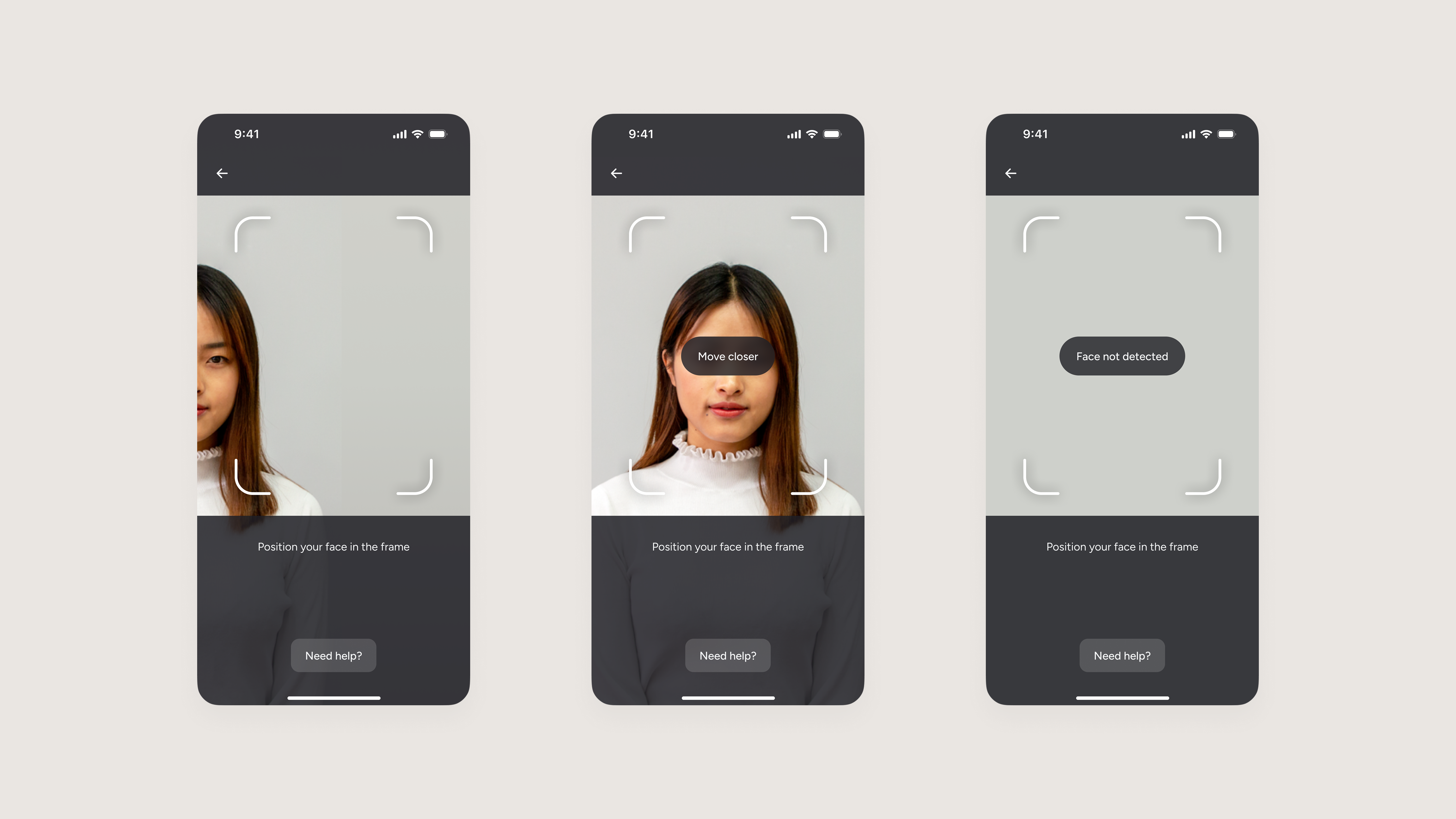
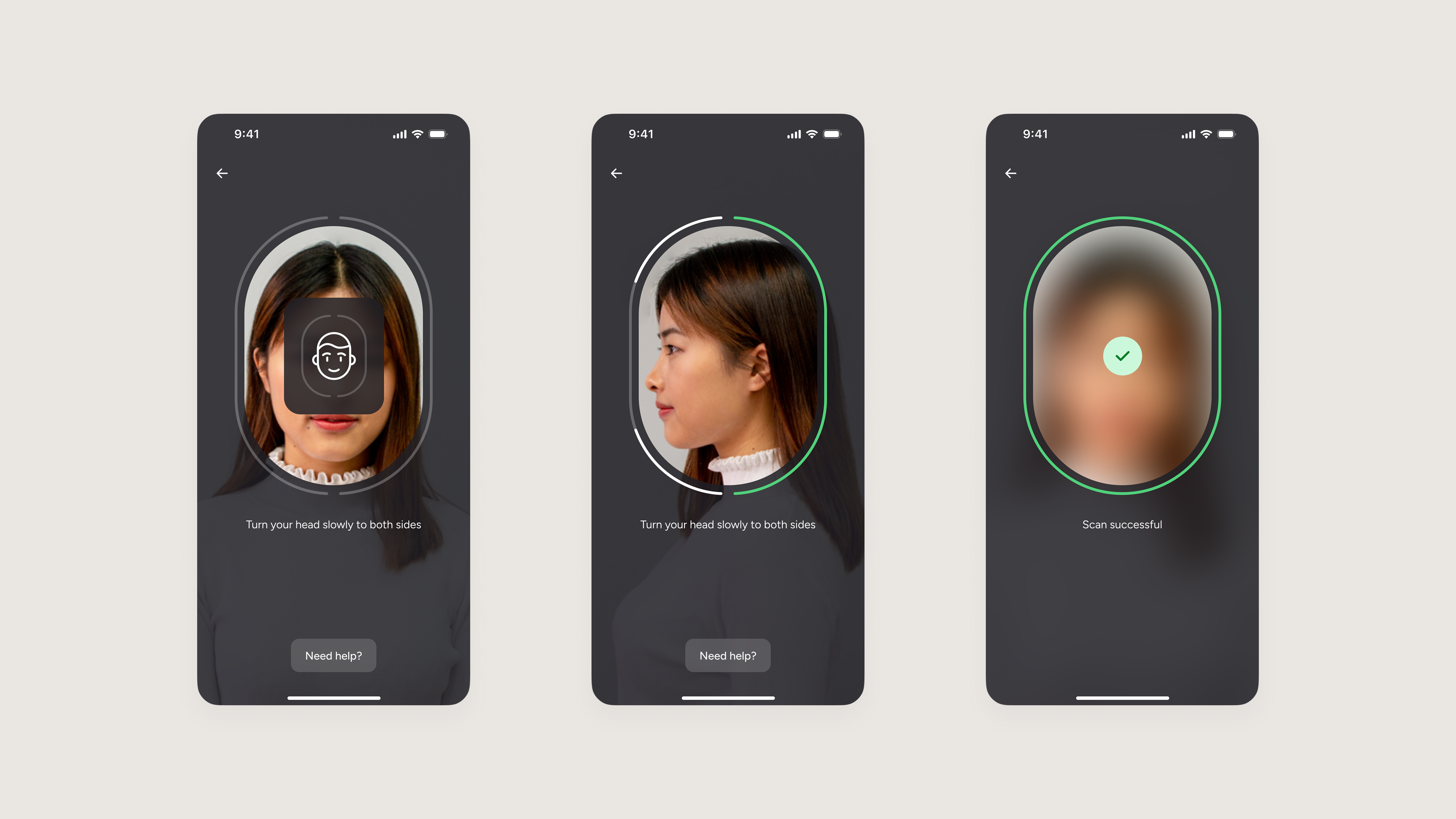
According to our tests, head motions felt more natural. Users intuitively understood the connection between the movement and the verification process. Head motions were also more predictable as the possible physical movements are limited. Overall, users preferred a lateral head-turn movement which provided enough signals for Machine Learning models. We discovered that requiring users to turn their heads in a specific order was limiting users’ control, and they preferred the freedom of turning their heads as they wished. Additionally, a majority of users wanted to be able to keep an eye on their screen while turning their heads, meaning we had to reduce the range of movement required.
Eventually, I created a completion pattern as an intuitive way of guiding our users. As the users turn their heads to the left or right, a progress line follows their head movement and indicates when a side is complete. I also added vibrations at key moments to draw users’ attention and provide granular non-visual cues.
Completion pattern with vibrations (audio ON)
Validation on all platforms
After finding the best user experience for iOS users, I needed to check if our findings also apply to Android and Web (desktop) users. I worked with engineers from the three platforms to create and test native prototypes on iOS, Android, and Web (see below).
The head-turn experience on all platforms
Even though users from the different platforms tend to have their own mental models (for instance, iOS users are used to Face ID head-roll motion), all users were able to use our new head-turn experience with no problem.
There were a few adjustments that needed to be made to provide the same experience on all three platforms. Our team had to refine the pattern on Android and Web as their face tracking was not as smooth as iOS. We also realised how much the difference between devices and cameras could impact the user experience. This pushed us to test more devices.
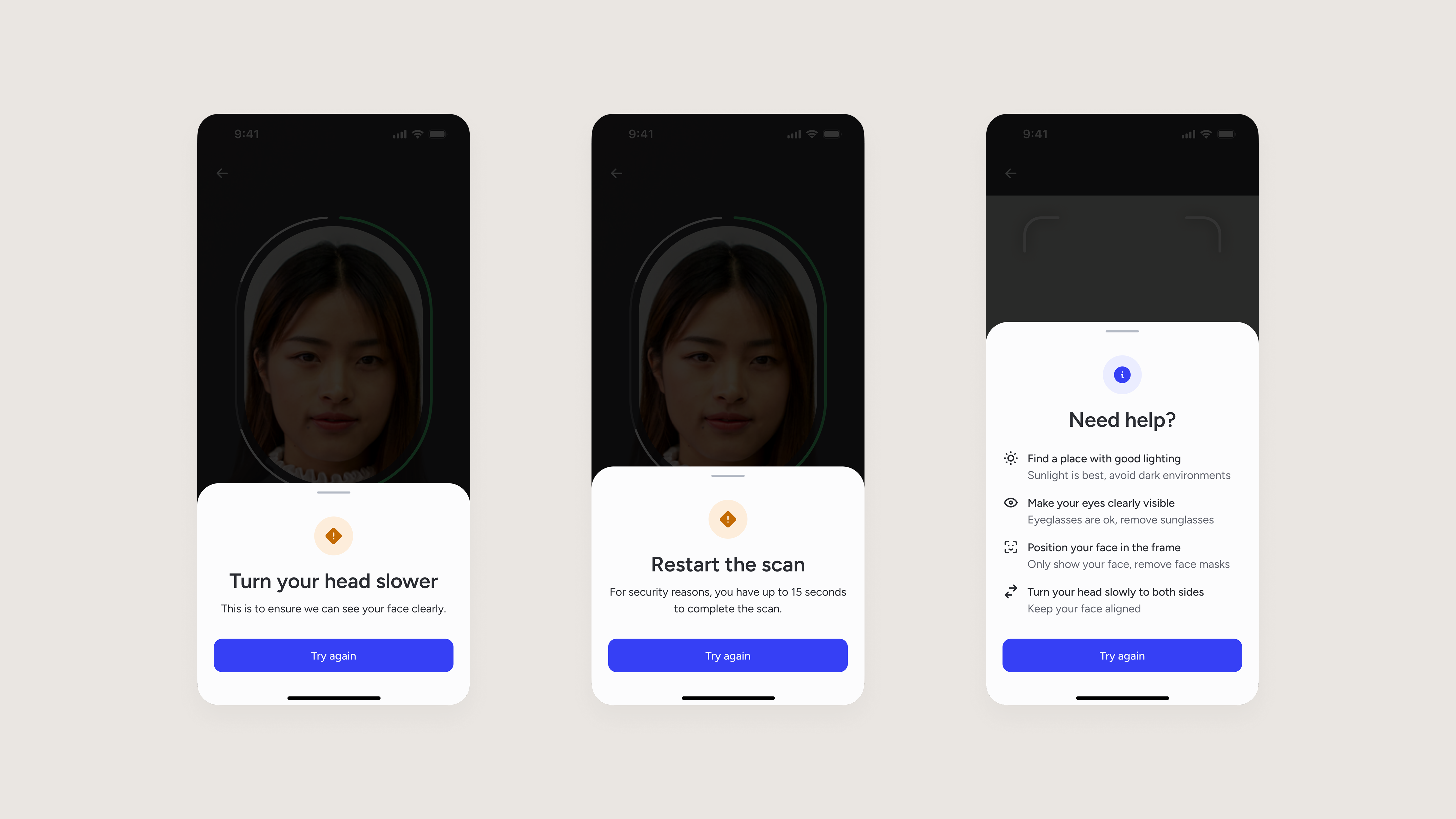
Accessibility
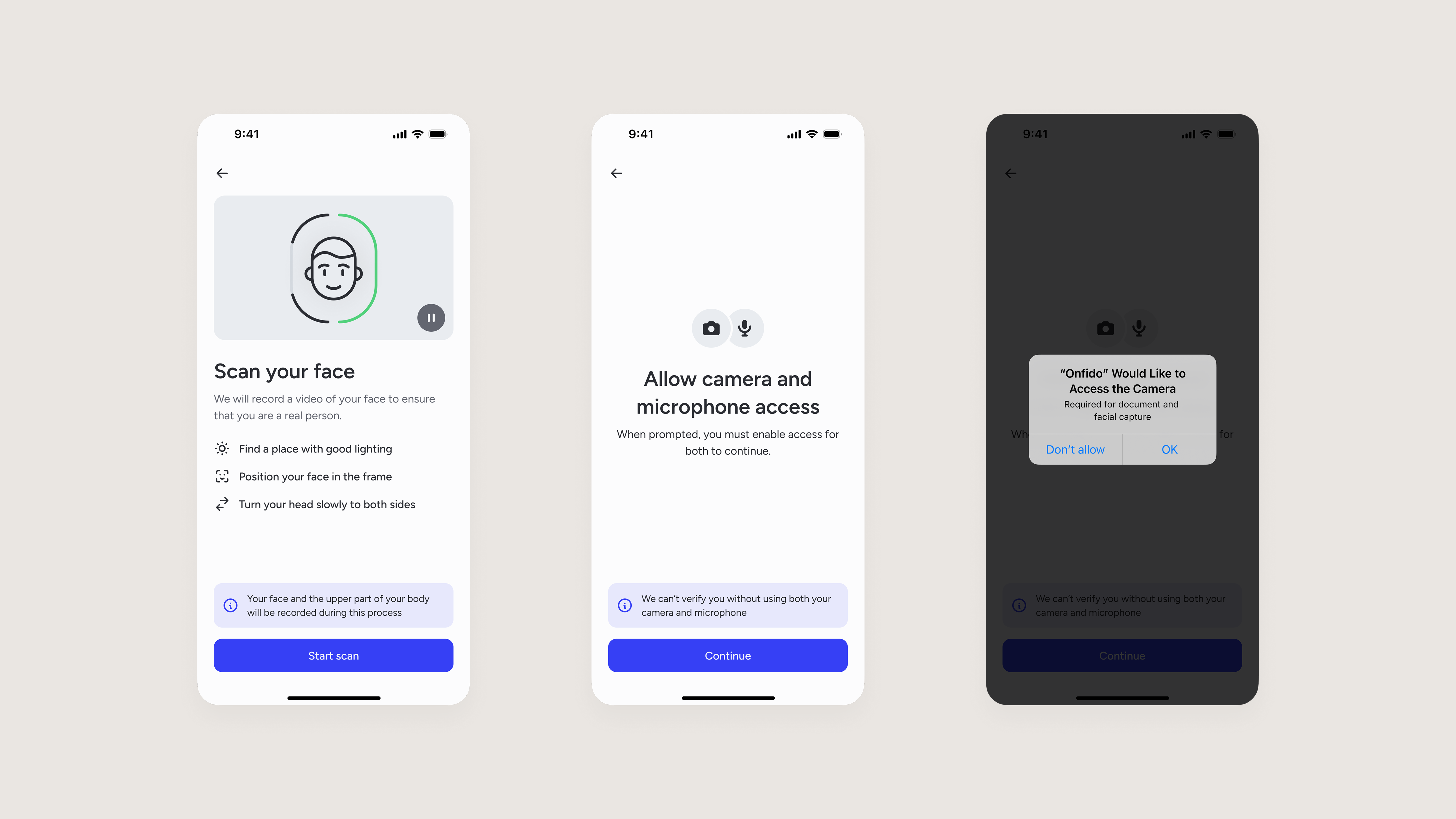
Given the audience for our products can be anyone, we needed to ensure this new UX complied with accessibility standards (WCAG AA) before releasing it to production. Most of the accessibility requirements were met by design, thanks to our design system, but the main challenge with live captures is to provide a smooth experience for visually-impaired users (~1-3% of the population). To do so, I worked with FE engineers to create a tailored screen readers experience.
The screen reader experience (audio ON)
Alpha release
Based on all the previous learnings, I designed a simple flow with the lateral head-turn experience that would fit into our overall identity verification process. I then worked with iOS and Android engineers to implement Motion in our Software Development Kit (SDK). (see below).
Before launching this product with real customers, we asked 40 users to test it and to fill out a UX survey to understand how people were experiencing Motion at a bigger scale. This UX survey will be re-used for future major updates. This way we can compare results and measure improvements over time. Finally, our Product Manager recruited 3 customers to Alpha test the new Motion product.
The entire Alpha Motion flow
Motion enables our customers to set up an account in seconds and be on their way on one of our mopeds, while enabling us to keep operating costs low and run efficiently as an agile and high-growth business.
Results
Measuring success
We were all extremely proud to see real people using Motion to verify their identity with no problem! We are now waiting for more users to capture their faces via Motion so that we can learn from them and move to the next stage of iterations.
The qualitative and quantitative feedback we got from users, and metrics we tracked from our production data, allowed us to analyse how well we performed against our goals so far. Quality of the user experience measured against the product principles that we created:
Simplicity
82.5% of users found the steps easy to complete and 90% of users succeeded in capturing their faces on their first try.
Control
Users can decide the order of head-turns and keep their eyes on their screen.
Speed
The head turn interaction is fast, taking only 5 seconds (median) for people to complete.
Delightfulness
92.5% of users reported a positive experience.
Accessibility
We achieved WCAG 2.1 Level AA compliance following an independent accessibility audit conducted by the Digital Accessibility Centre (DAC).
Transparency
Users can see which data will be collected. To be fully transparent, 45% of users said they would like to see a preview of the recording.
Technical performances of our product measured against key performance indicators:
Automation
We successfully achieved a product with 100% automation.
Processing time
99% of users’ faces are processed in less than 20 seconds.
Pass rate
96.6% of users’ faces have been cleared.
False Acceptance Rate (FAR)
We are below 1% of falsely cleared users.
False rejection Rate (FRR)
We are below 1% of falsely rejected users.
Fraud prevention
We were granted iBeta level 2 on both iOS and Android.
Next steps
Since this article was written, I worked with a Product Operations Analyst to track specific UX metrics and measure the performance of Motion at scale (e.g. drop-off, completion timing, percentages of first-time success, etc.). I then turned these metrics into insights to fine-tune the user experience.
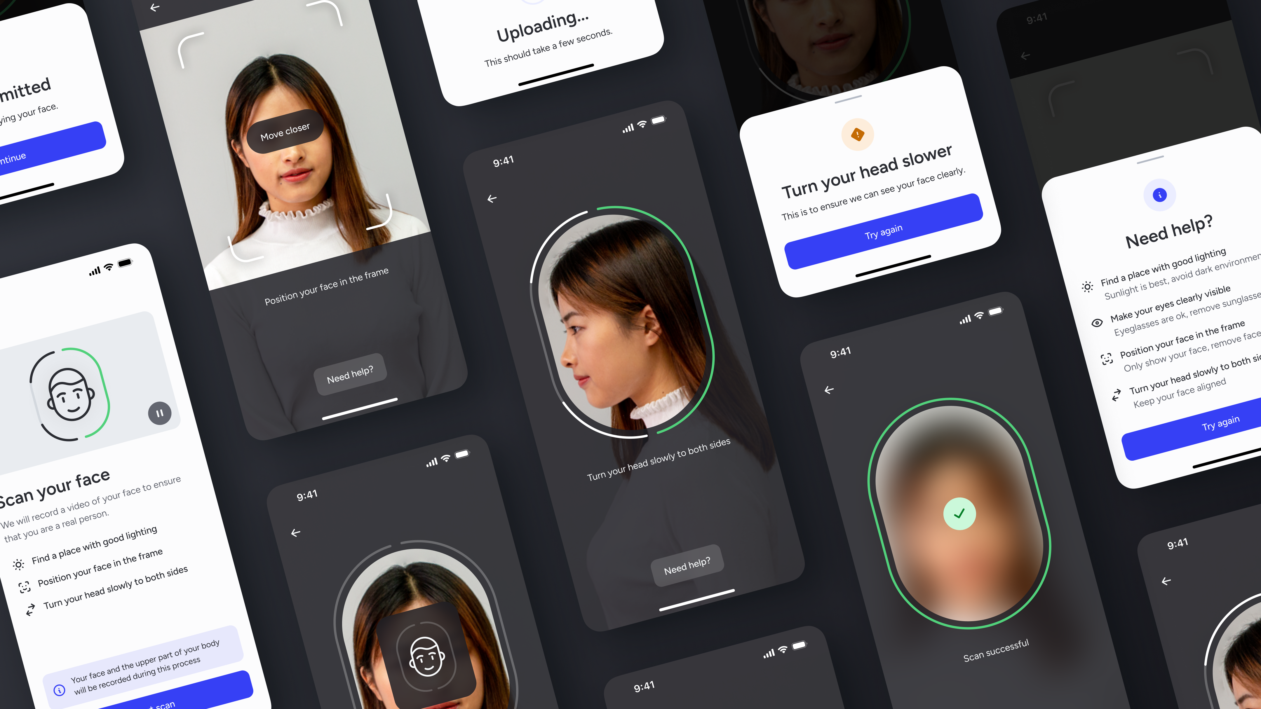
Preparation and permissions
Face alignment
Head turn
Feedback and help
Submission
We launched our Beta release in September 2022, which was used by 100,000 users monthly. This was followed shortly by our General Availability release. In 2024, Motion has been adopted by 500+ customers, averaging 5 million users per month, and outperforming our previous biometrics products. This product launch has been a great success!
500+
Customers
5M
Monthly scans
97%
Success rate
Learnings
Cross-functional collaboration
Building Motion was a team effort. I constantly collaborated with different stakeholders from various functions, listening to my colleagues and making sure that I have a good understanding of what they were trying to achieve while advocating for good design. This was essential to designing a realistic solution.
Iterative process
My team followed a two-week sprint approach. This allowed me to focus on designing and building essentials, test various prototypes, and gather feedback from real users as quickly as possible. Consequently, I was able to learn, reflect, and iterate fast. This approach has given my team and me confidence in the success of my designs throughout the entire process.
Measuring success
To reflect and improve on my solutions, measuring success was done at each iteration. The way in which I measured success evolved according to the stage of the product. In the early stages, we mainly collected qualitative data by talking directly to users. Then, we collected both qualitative and quantitative data by testing a few prototypes on a bigger scale. Finally, we collected quantitative data by tracking users’ behaviour in production. My job was to translate these different types of data into insights to validate the success of my designs.
Oh, and my face eventually appeared on a billboard in Las Vegas as part of our launch of Motion ads during the Money20/20 event.
The appearance that made me famous