Overview
Context
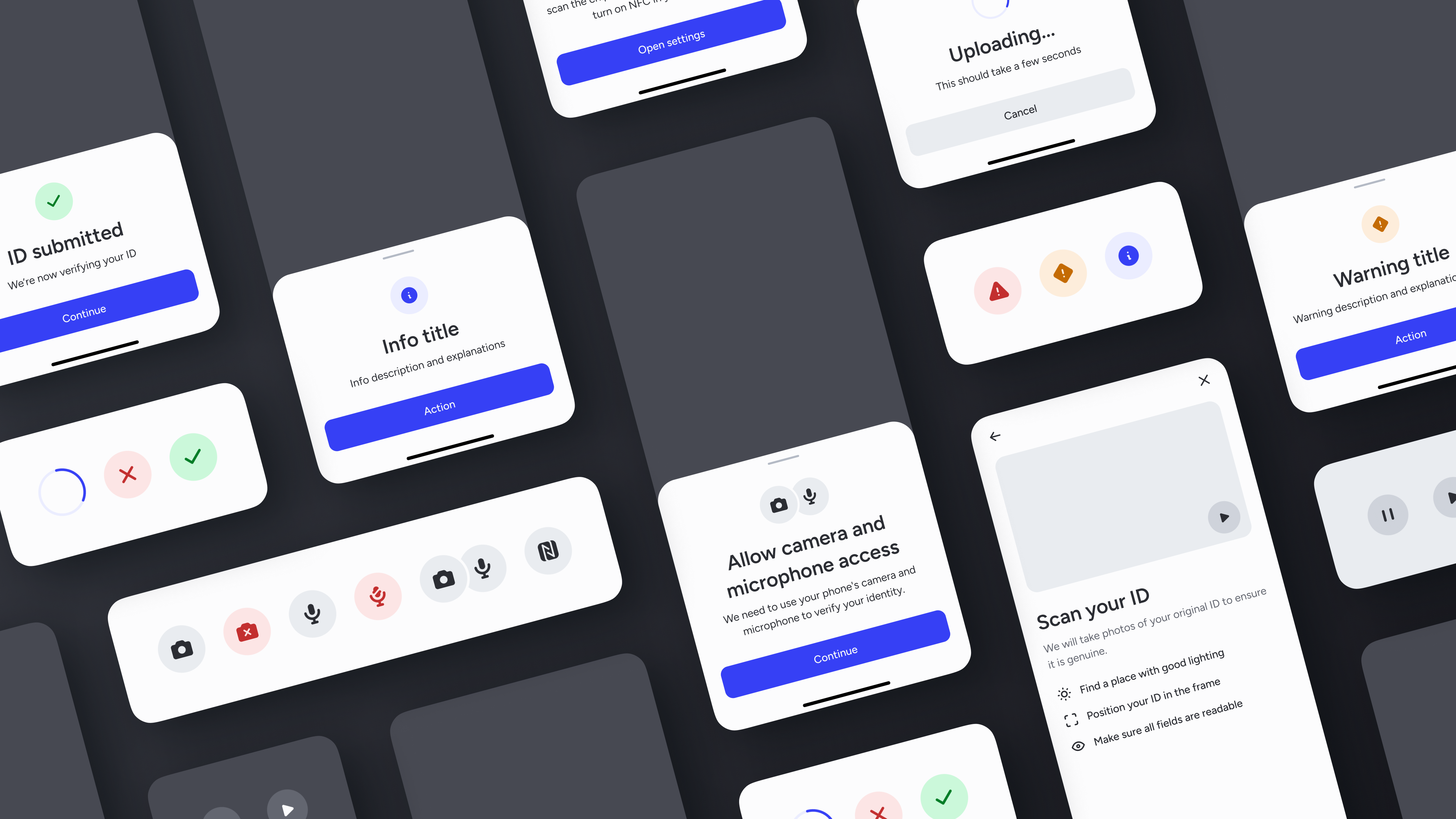
At Onfido, we build various products for users to verify their identities. All of these products share similar UI elements which are part of our design system. However, some of these elements have been designed a while ago, and don't meet our standards for good design anymore.
We use many different icons across our products, but there is a small set of icons that we use very frequently to illustrate key screens. This article focuses on these icons as well as icons for our media player.
Problems
For status, upload, permission and player elements, we currently use icons within a circle. The current design has a few UI issues:
- Icons are not consistent (e.g. mix of outline and filled)
- Some icons lack differentiation
- Most icons lack visual weight in our products
- Some icons (e.g. player) lack optical corrections
- Overall, the current icons feel old fashion
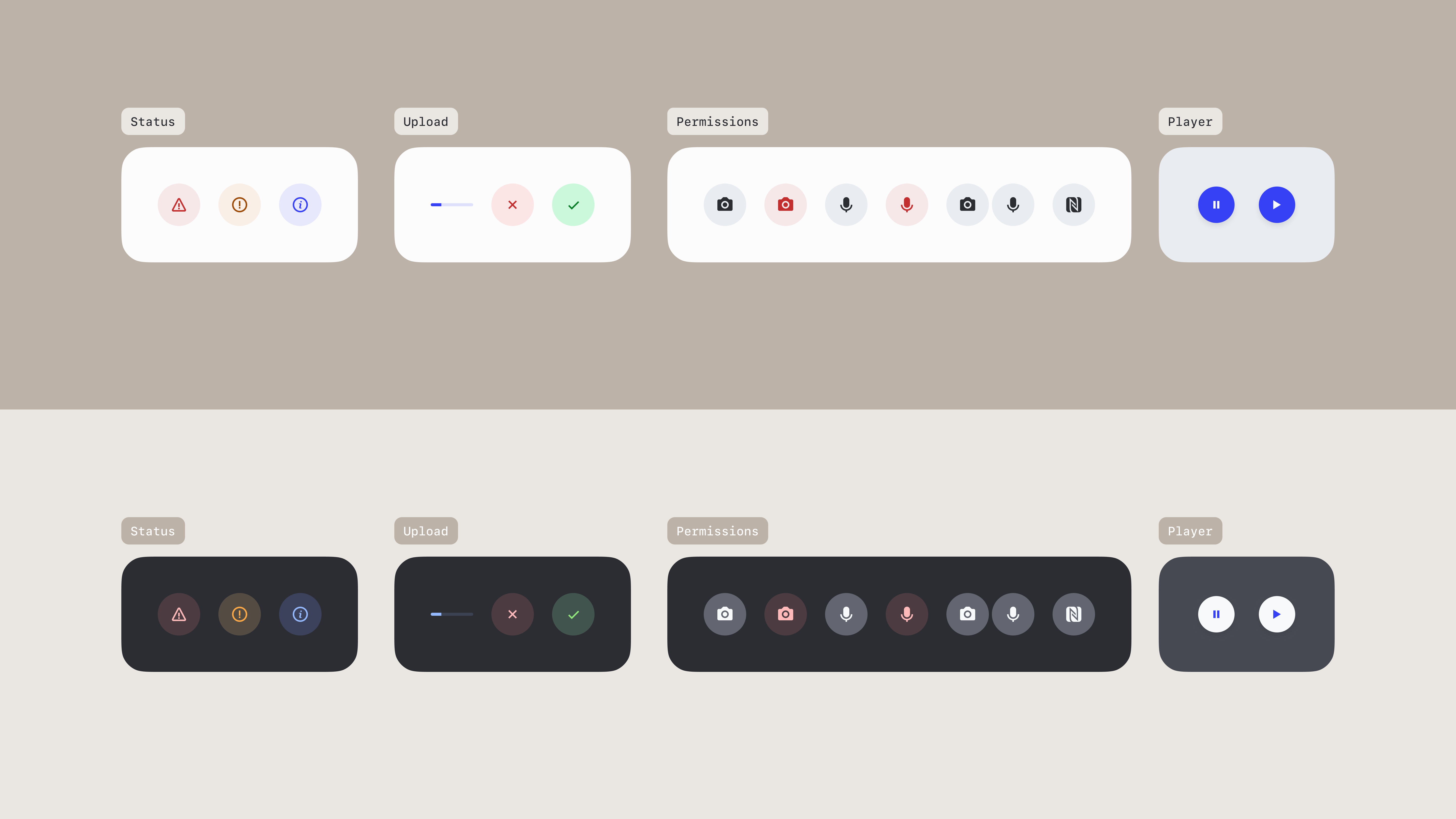
Current set of icons
Design process
I redesigned this set of icons in a way that addresses all the problems listed above, testing them in context of various screens to ensure they worked well. I also ensured that the style of our new custom icons were future-proof with the new icon library we’re considering for the rest of the icons across our products.
We usually use 24px icons in our products, but these new icons will be 32px icons in 56px circles, in order to stand out more. Media player icons will stay at 24px since we use them in our standard 48px buttons.
New set of icons
Motion & haptics
Animating icons can bring some life and delight to the user experience. However, not all icons should be animated, as it can easily add noise and overwhelm users. For this set of icons, I only animated the fail and success icons, which are shown to users at key moments in our products.
Haptics also add life to products though non-visual cues. We already use haptics for key events, but we don't harmonise them with the UI. When animating these two icons, I decided to map their timing and velocity to iOS' fail and success haptics, which we use as a reference for our haptics.
I used AfterEffects and Lottie to create SVG animated icons. I then adjusted the timing of icons, paired with haptics, in ProtoPie.
Example of animated icons (audio ON)
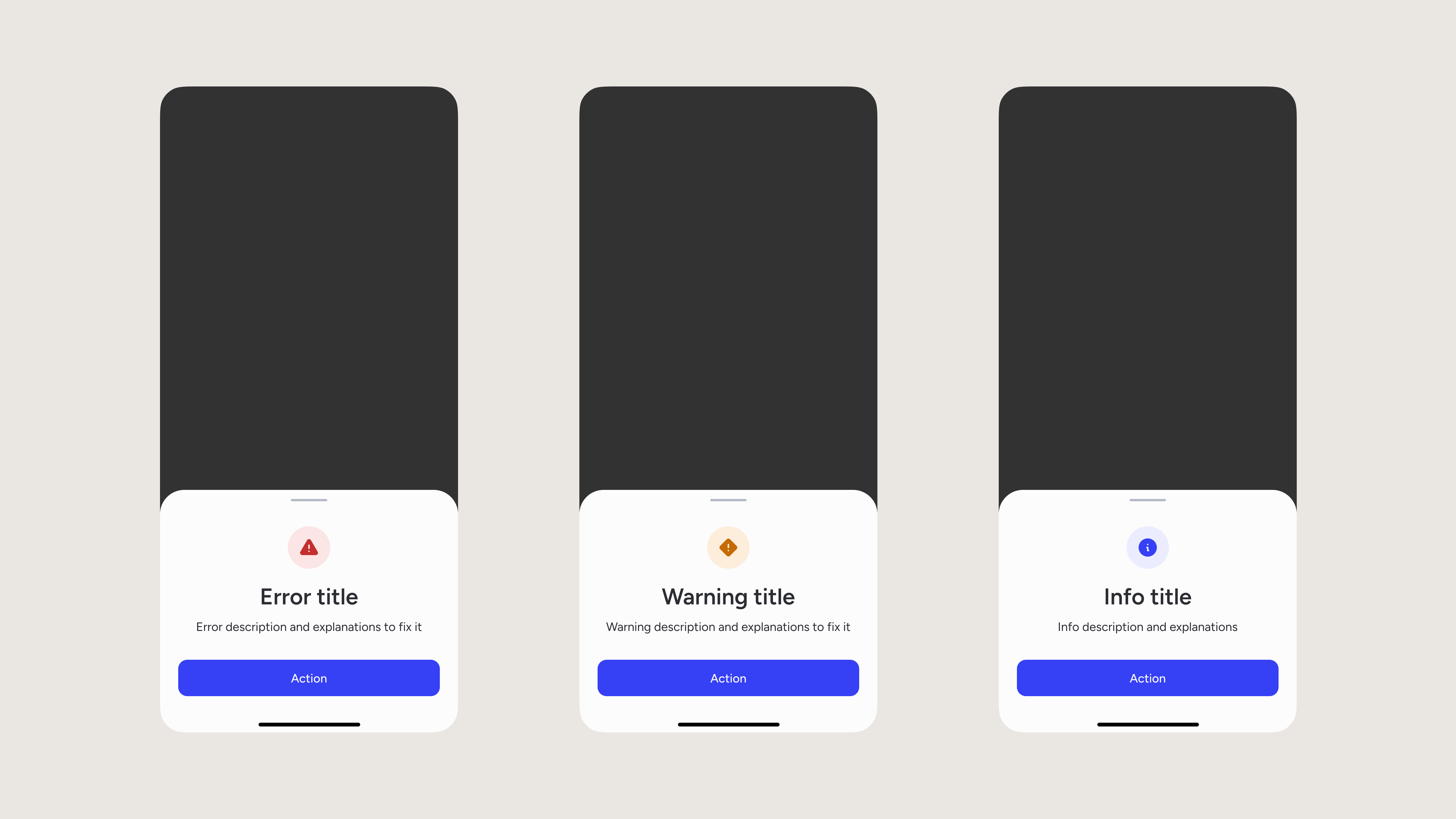
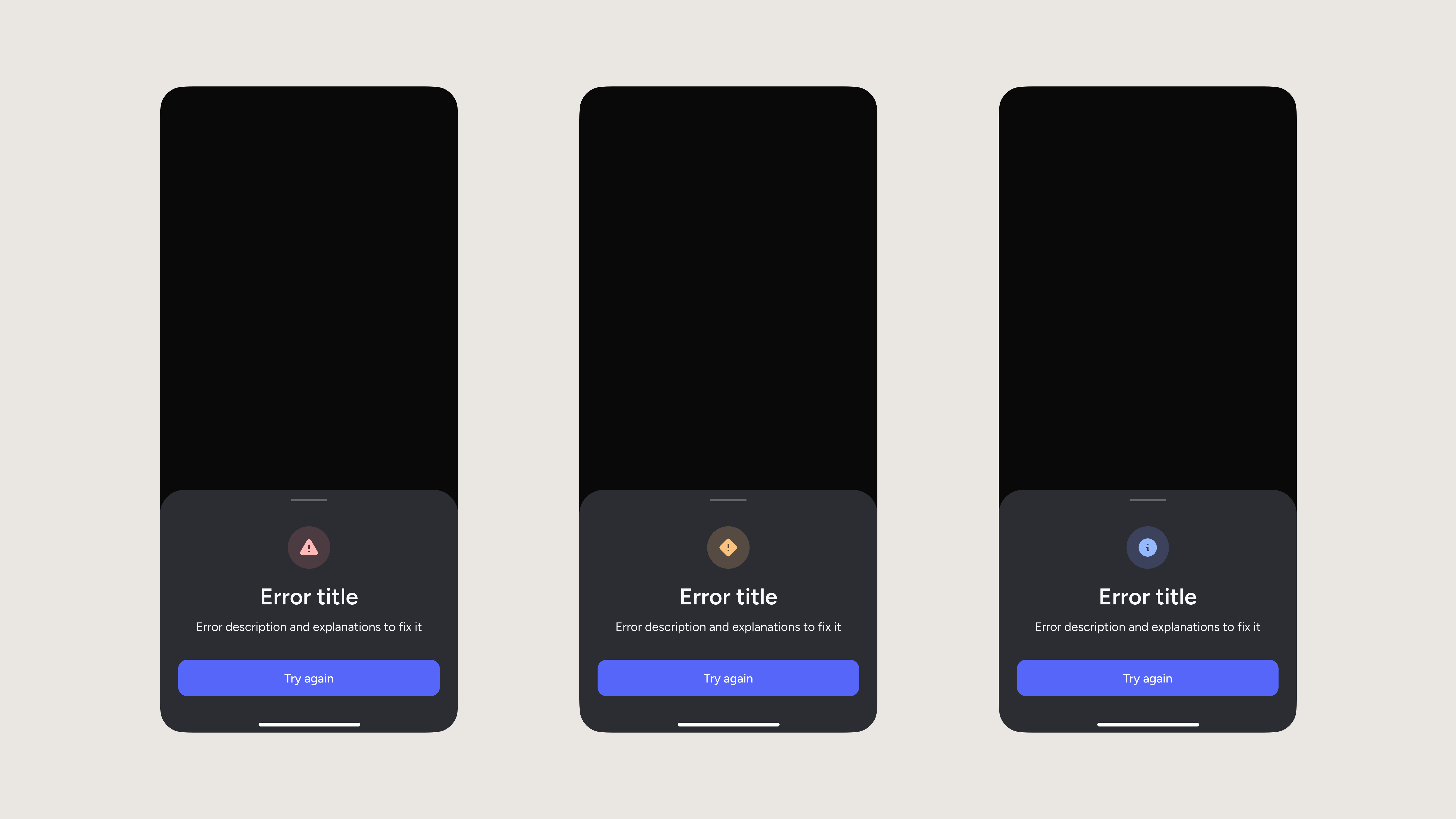
Status
For status icons, I wanted to ensure they were easily distinguishable at first glance. To do so, I used filled icons, different shapes and a commonly-used colour code. I had to make a few optical corrections so they feel like they have the same visual weight. I also adjusted the colours so they look even between light and dark mode.
Status (light)
Status (dark)
Upload
For upload icons, I started with harmonising the progress bar with the thickness, shape and space used by the fail and success icons. I then increased the size of the fail and success icons, so their visual weight feels consistent with other icons. Finally, as mentioned above, I animated them, so the submission moment feels more organic.
Upload (light)
Upload (dark)
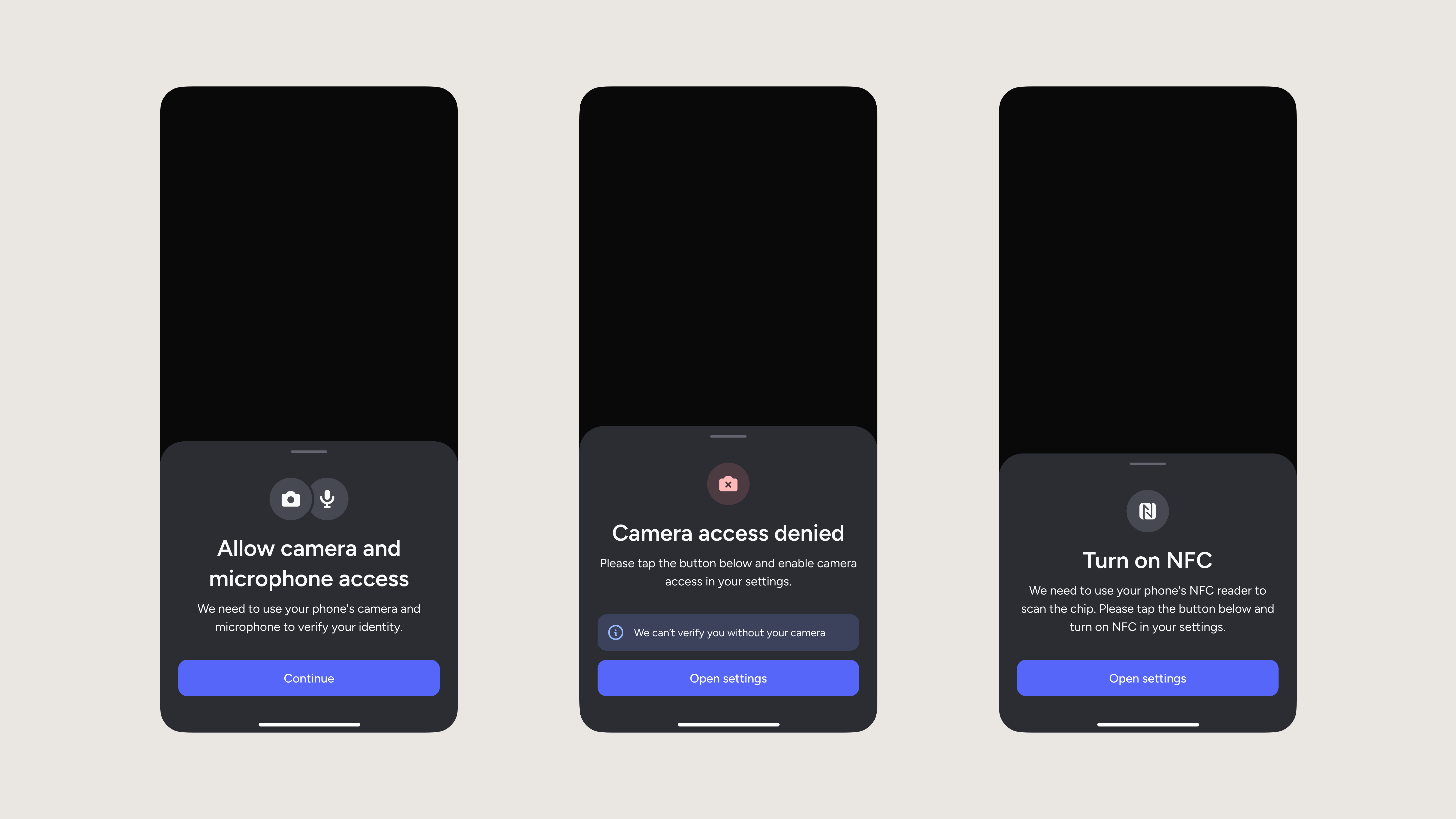
Permissions
For permission icons, I first cleaned up the camera and microphone icons and adjusted their visual weight. I then updated their error versions so they’re more distinguishable. I also created a nicer wrapping of icons, slightly overlapping each other, when multiple permissions are needed at once. Finally, I harmonised the NFC icon to make it more refined and consistent, while keeping it’s original style, so users can recognise it.
Permissions (light)
Permissions (dark)
Player
For the player icons, I kept their size at 24px since they’re consistent with the size of icons we use inside buttons, but I fixed their visual balance to be more readable. I also adjusted the play icon to be optically centred. Finally, I made the visual weight of these buttons way less prominent since they are secondary interactive elements; only a minority of users with accessibility needs will use them, and I didn’t want all users to see this button as the first element when landing on that page.
Player (light)
Player (dark)
Conclusion
Craft with care
I'm very satisfied with how this new set of icons looks like, and received positive feedback from other designers.
These are small details in our UI, but they already elevate our products and make them look more professional. I know users may not notice an obvious difference, but having products crafted with care is something users can feel overall. We often hear users mention how much a UI crafted with care makes the product feel more serious, and as the result, they assume the rest of the service has the same level of quality.
Our SDK is intentionally quite neutral, given that it has to fit seamlessly into customers' flows, but this doesn't mean we shouldn't bring some sparks of identity to it.