Team
Brief
When I worked at Brooklyn United, there were three meeting rooms that we managed through Google Calendar to book them. Some people in the office started to wonder if this service could be improved, since we could not see dynamically the status of each room. I thus had to find out if Google Calendar really fitted our needs at any point and to look for a solution if not. My primary focus was on sharing an updated status of a room office-wide.
Roooms is a service allowing simple viewing and booking of meeting rooms that fits Brooklyn United's needs.
1Define
To fix the problem I had the choice between different features and technologies. Acknowledging the heavy lifting and overlapping features of existing apps we are tethered too (Google) and bloated 3rd party services, I focused on simplifyling the core need of sharing availability.
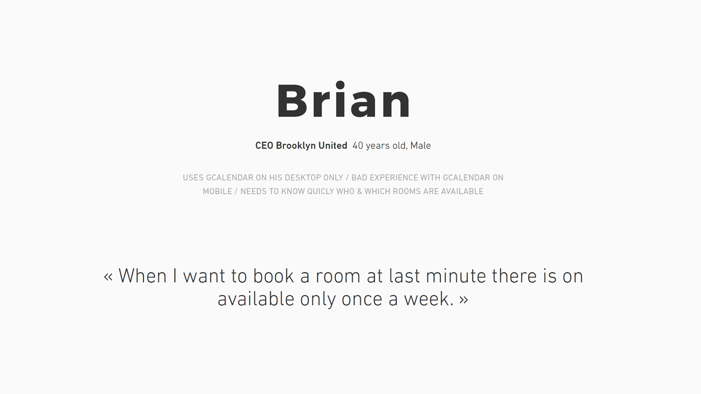 Some personas I did.
Since the users were just besides me, what a better way to start than making interviews. Even if the users were all from Brooklyn United, there were different typologies of employees that means different expectations about the service.
Questions were very wide to have a glimpse of the user; from habits to tasks to achieve or even personal reviews of the service. These interviews allowed me to create some personas using sentences that best describe employees needs.
2Imagine
I organized all my ideas and features into a mindmap. Using feedback from the previous interviews I was able to build a general userflow for both desktop and tablet (mobile devices). This mindmap was a kind of utopian vision of the project but allowed me to think wide to be able then to make a better MVP (Minimum Viable Product) with the core features.
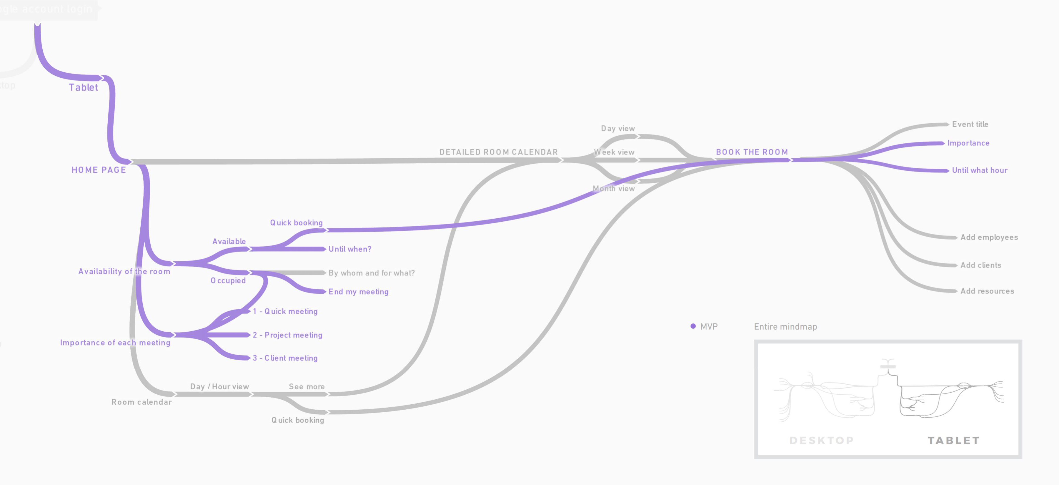 Mindmap of the service.
Employees already had a desktop tool and were looking for a better mobile experience. Their need was also to manage quickly the meeting rooms. This is why I started with a mobile first app (responsive to be used on desktop) containing the core features.
 Scenarios of the main features.
3Create
I made Sketches to think about the app layout. There are more or less features to figure out what would be the MVP.
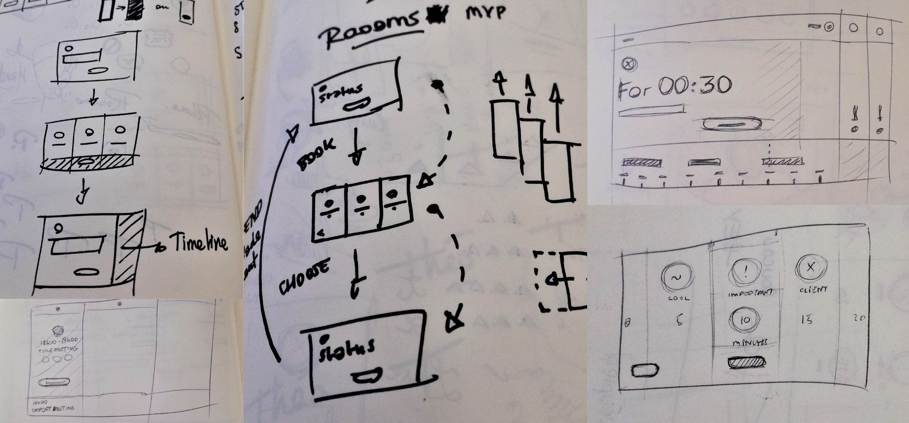 Interface sketches.
I did some monitoring to find UX and UI inspiration around schedule/calendar services using different devices. This step is essential before starting to create.
 A few design inspirations.
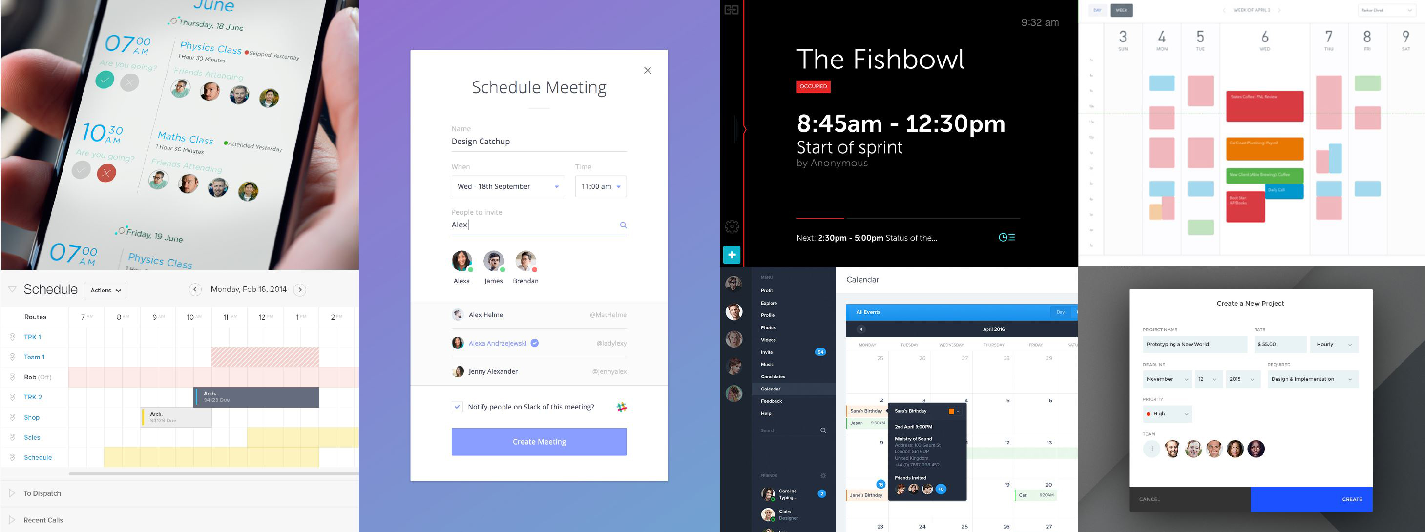
I started by making the homepage which showcases the three rooms (one room per column). On the same line than the name there is a check box that allows the user to display or not a room (like an accordion menu). The idea here is to make a full responsive service to use it from your desk with the three columns displayed or in front of a room with just one column displayed.
 Roooms homepage.
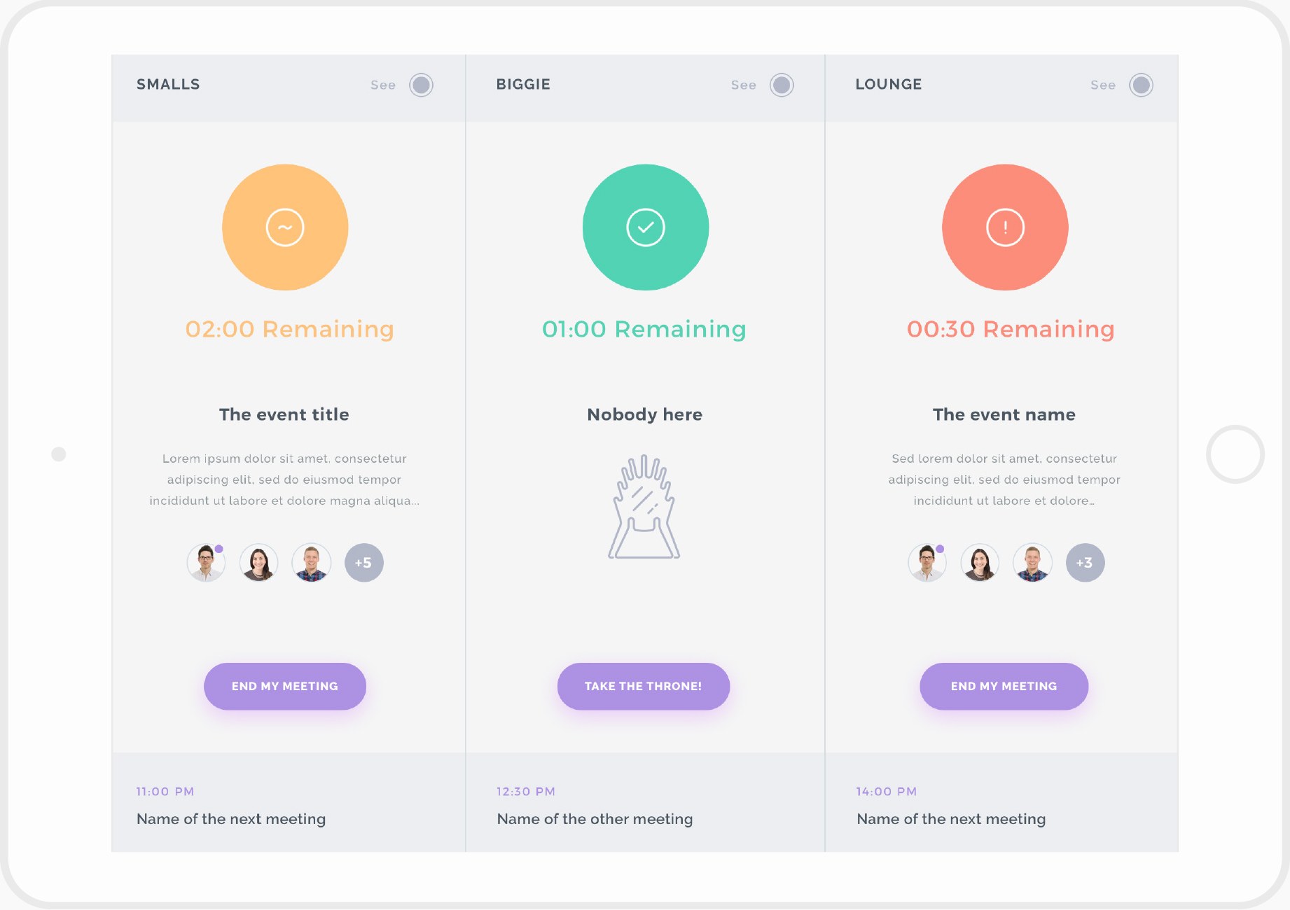
When the user clicks on the «Take the thrones!» button, that will open the booking interface. We can add a title, choosing how important the meeting is (casual, important, client) and then picking the time.
Adding a description and guests would be exhausted on a tablet, creating a meeting has to be pretty quick. The description and guests that we can see (first and third column) are for the meetings created on desktop, for now we could get the data from Google Calendar.
 Roooms quick booking interface.
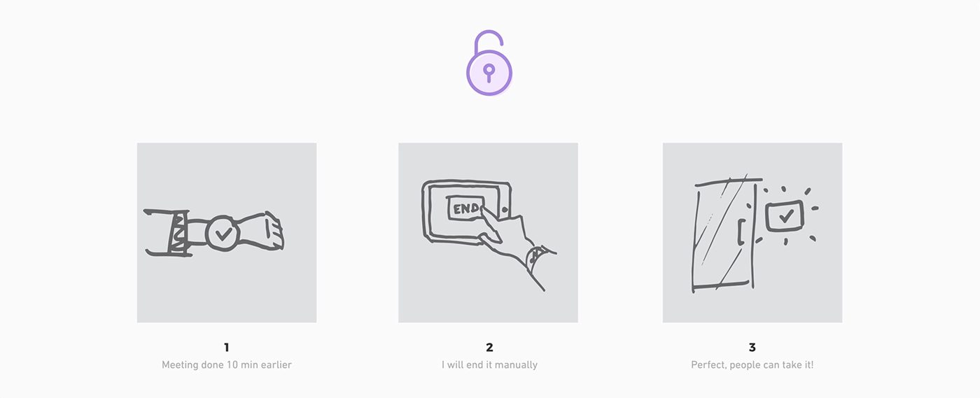
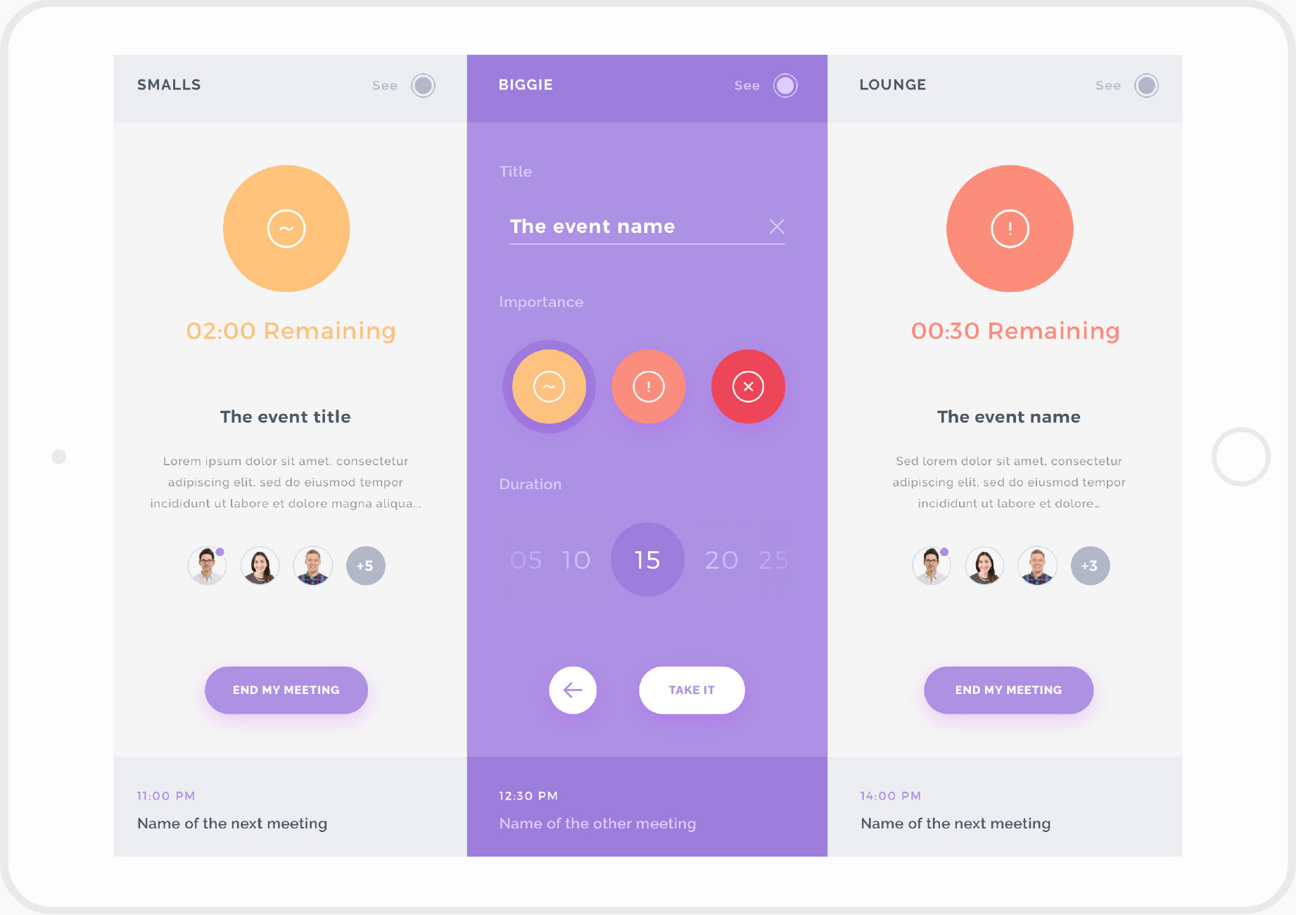
This interface is made to be used on a tablet in front of a room. We can see the color from afar which is great to see the status from a desk. The focus is also made on the countdown to inform people when the meeting will be done.
 Roooms status page.
All these interfaces already had a lot of features in them. These features are really useful but some of them are secondary. I realized at this moment that I could make even simpler, with less features; the real MVP.
4Improve
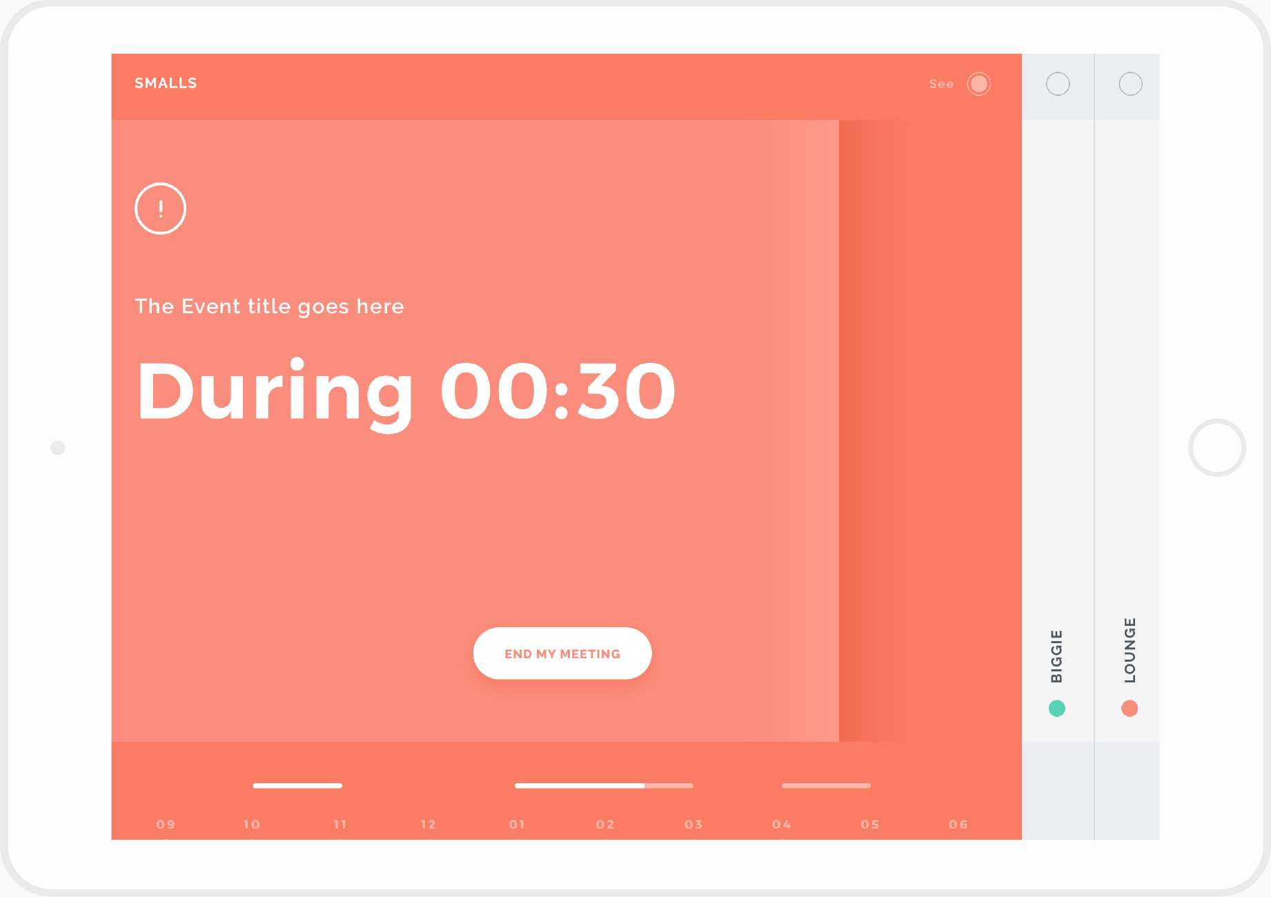
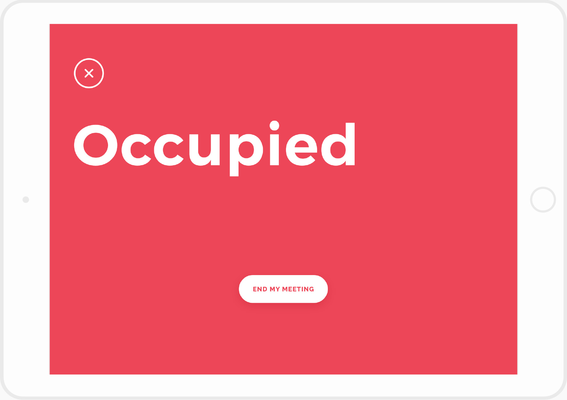
Since this MVP is first made to be displayed in front of each room I decided to display only one room per tablet/screen instead of having all of them. For now on the status screen we can just see if a room is «availlable» or «occupied». The goal was just to book a room quickly and being able to see its status to know if this is important or not.
 Roooms individual status interface.
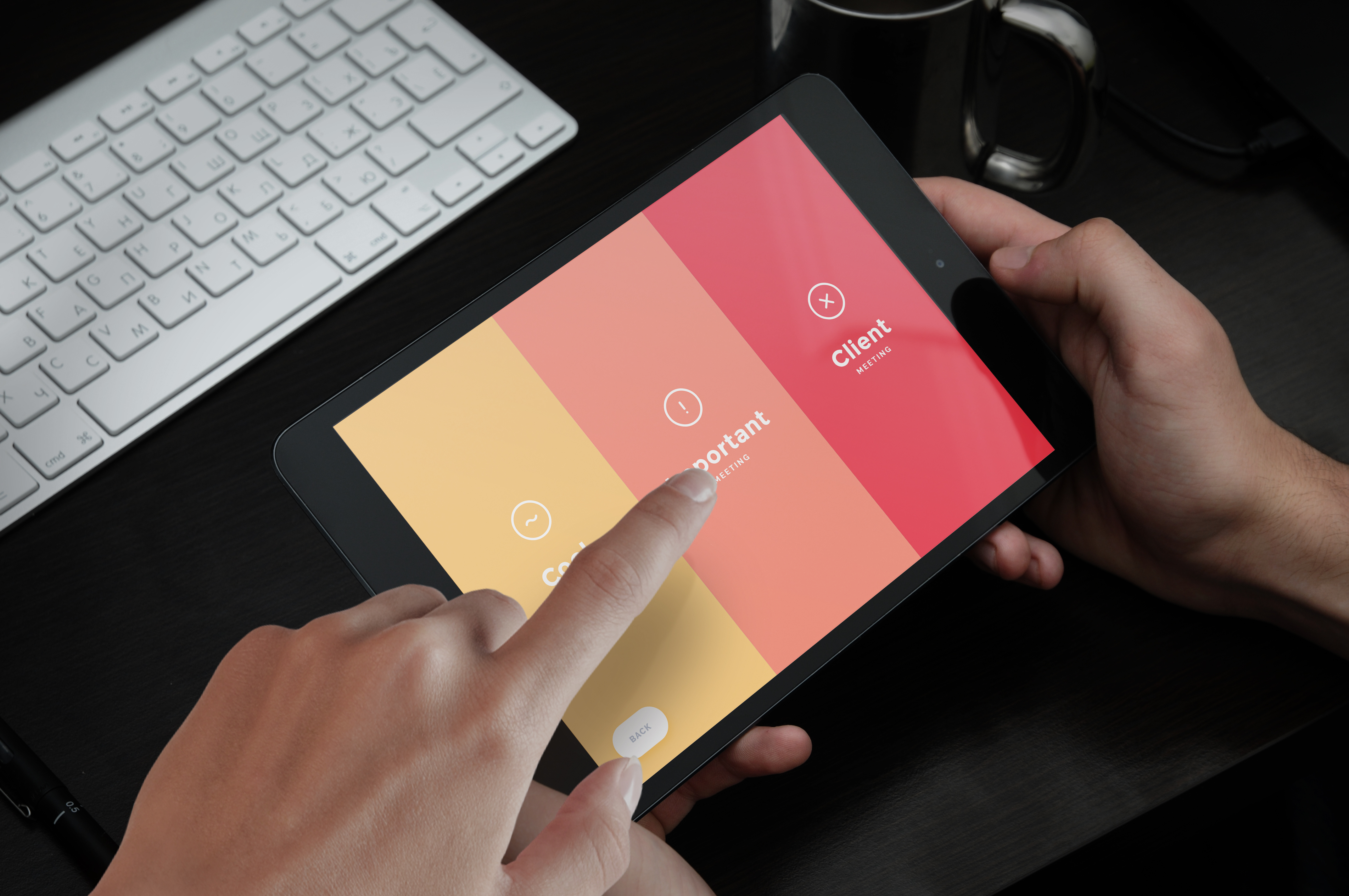
To book a room the user just needs to choose how important will be his meeting to let people know if they can interrupt the meeting. Since there are not a lot of features on this screen I created these 3 big touch zones to interact easily. At this step the product was not finished, that was just the first version with the core features.
This MVP was tested by the employees to be sure that the app was consistent and to have feedback for the next updates.
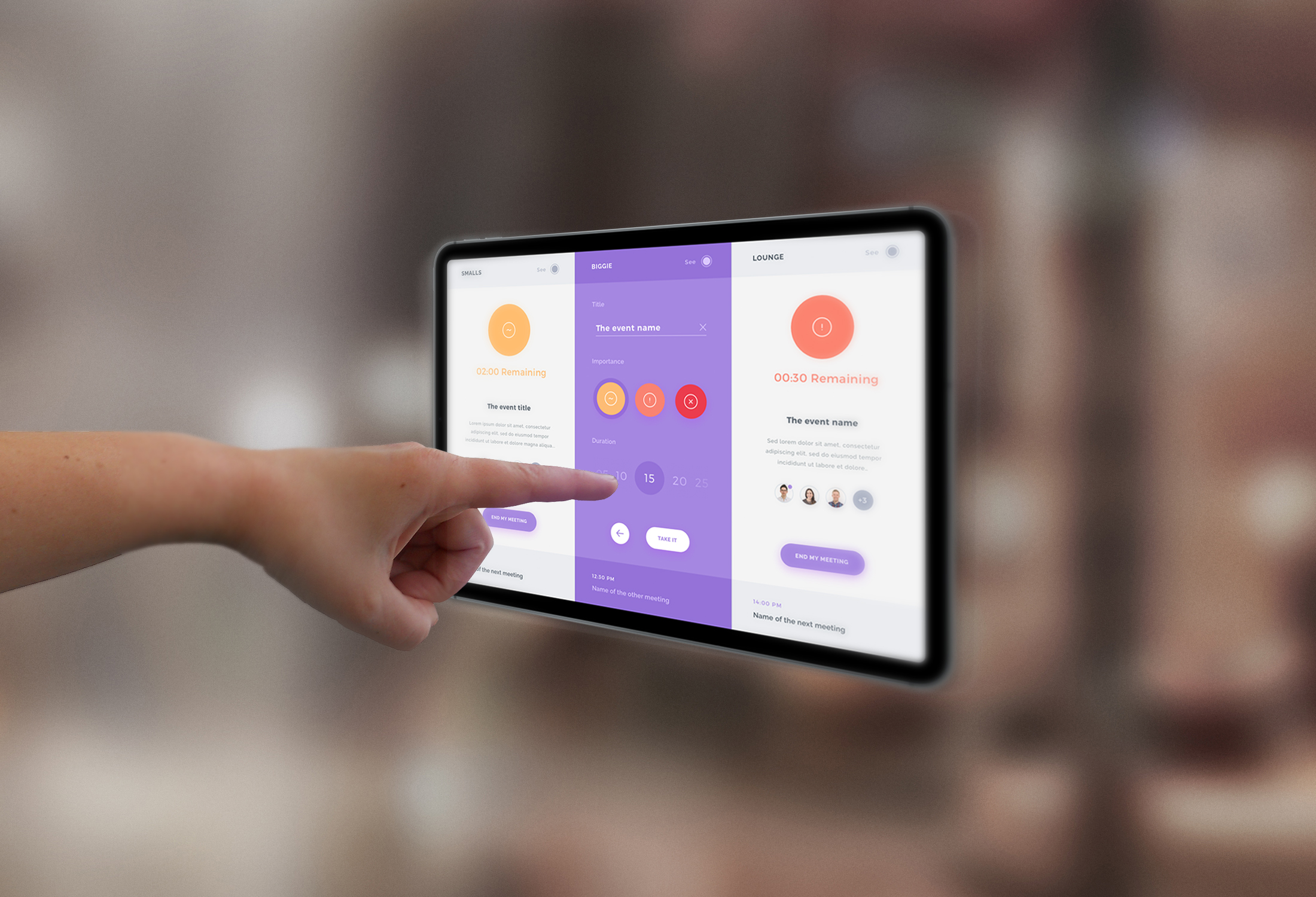
Every user was able to book a room and end a meeting. Even if the availability of a room was really readable, it would be easier for the user to know when the availability will change. This is why I added a time picker, to know how long each room will be booked. The next step will be to link the time picker with Google Calendar to match with the round hours (by chunk of 5 or 10 minutes).
 User testing time.
Since I started to add features like a time picker that was tough to make a viable protype using InVision because the user experience would not the real one. Interactions and dynamic elements are very important to help users through their experience inside the app (and I need feedback about these interactions to improve the UX Design). These are the reasons why a coded prototype (HTML, CSS and JS) was the next right thing to do.
 The final MVP in front of a meeting room.
Managing this case study from the begining to the end was a great experience to improve all my design skills. Jonathan Burkett and Ana Jovane helped me through their experience to make a consistent projet without burning steps.